Indie Marketing 101: The Right (And Wrong) Ways To Market Your Indie Game
WEBSITE ESSENTIALS
As making a website is all important for those first impressions, it seems right to have a more in-depth look at the rights and wrongs, plus we can show you some examples during this part. Examples are fun.
While indie game development is usually very exciting and probably considered quite an informal activity itself, you should try to come across as professional through your website. Even if you’re a radical, anti-establishment, trashpunk rebel; you want people to stay on your website and find your game interesting. Using a professional approach doesn’t mean you should put on a suit and shake hands with your website, you merely need to ensure that it is easy to navigate, informative and using visuals for an eye-catching presentation always helps too. Think of “professional” in that it is the opposite to amateur, essentially.
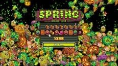
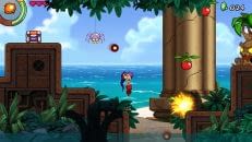
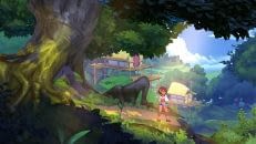
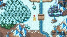
On your website, there should be clear sections for each component. Don’t overcrowd any single part and do have links to sub-pages rather than cramming everything on to the front page. This much is probably obvious to most of you. Apart from functional, you also want your website to be appealing and, hopefully, fun. What do you have at your disposal to spruce it up? Game screens of course! Or at least, art work of some kind with any luck. Make it colorful and appealing to the eye but don’t distract from the focus, which is the game. Why not add a little bit of movement in there too – if you have your game trailer then certainly have that in good view for visitors to watch.
In brief, what you need most importantly to interest visitors is a brief game description, some screenshots or concept images and a trailer when you upload it. That’s really the bare minimum. For press, you should consider having a dedicated and more detailed ‘Press Page’, so that they may hop on over there and find all the information they need about the game, contact details should be made prominent and even a couple of downloads might be provided, i.e. a press kit.
Your website can and most likely should act as the hub for your community too. Including ways for visitors to comment on your posts, submit their own content or go and chat in a larger forum is always a good idea. Social media links so that visitors can easily share your website to more people is practically a must-have nowadays, so include those where appropriate too.
Moving on, let’s have a look at some examples of good website designs:
Now, take a look at what we said above and then visit these websites and see how well presented they are. Concision, color, and most importantly they provide plenty of information and links.
With the good comes the bad and unfortunately it comes in droves. No website is perfect but there are certainly a number of things you shouldn’t do. We don’t normally like to pick anyone out in particular but we are going to right now just so that we can demonstrate what not to do when designing a website for your indie game or studio. Have a look at the websites below and you should hopefully see what’s wrong about them, if not, we’ve provided explanations further down.
Compare the latter four examples to the first batch and the differences should be obvious. If it’s not, then it’s time to break it down for you.
The Defy Gravity website is bad just because it directs you straight to Steam. Do not do this! It’s lazy and your game exists through a store front only. The advantage of being indie is that you can interact with people yourself – be a person, not a machine. Promoting your own game and interacting with a community shows that you’re proud of work and have not just put it together for a quick buck.
As far as the Gaia Dream Creation effort goes, the layout and color choice is just not eye catching at all. When you look at the website it doesn’t feel like it has any personality or life in it. Frankly, it looks like a website template and you never want that. The choice of game screens doesn’t provide any excitement, there are spelling mistakes and walls of text only drive people away.
Where to start with the PD Blaster effort? You’ll notice that this is an IndieDB page, not that there’s anything wrong with that in itself. For your information, there is a website for the game too, but it’s quite possibly the worst one of the lot. Focusing on this page though, there’s a whole host of things missing. Good prose for starters, then the lack of a header image, missing profile elements, appealing screenshots and so on. IndieDB pages are quite simple to set up – half the work is done for you – so make sure if you do choose to make one that you put some effort into presenting everything clearly, and add some pizazz in order to stand out a bit from the many other games on the site.
Lastly is the Blast Zone 2 website, which is the better out of this selection but falters due to clutter. There’s plenty of links to stores and social media, even the trailer is in clear view. But look at everything around it – it all just seems to merge into one and you get lost in a blur. Beyond that, scrolling down the page just presents loads of text in the form of development updates – which is good as we said earlier – but who is going to read that, honestly? Shorten the page up with a link to the rest of the updates (not many will scroll down far) and spice up your blog posts a bit with pictures and the like. Overall, not an absolute abomination, at least in the way things are laid out, but the presentation just acts as a deterrent rather than enticing people in.
Page 2: Website Essentials